Christchurch art room has become a second home for me. I first went over a year ago, and I’ve been going every week in term for 4-5 hours, learning lino printmaking. I am fond of the medium, the place, the teacher, everything. This will be a messy log of my progress, by Oxford term.
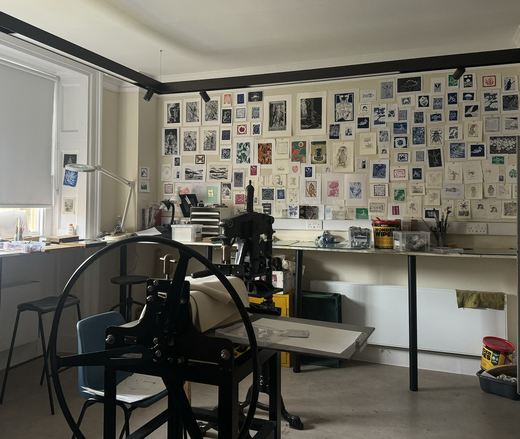 The art room
Michaelmas 2023
I enjoyed making small, cute, graphic prints that I could print off loads and share with people (e.g. Christmas cards, thank you notes). Lino was addictive for me because even simple designs look reasonably good— at least to the beginner’s eye.
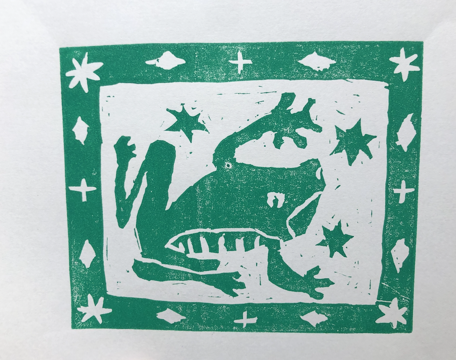 my first lino print ever
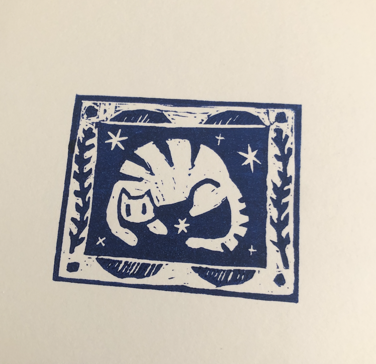 and the second one
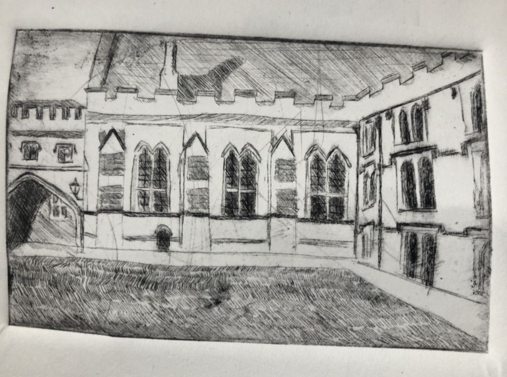 my first drypoint etching — I’m not a big fan of this medium
I was one of the first people that went to the art room; in the beginning it was tiny and scrappy, and it only supported lino. We barely had a printing press: somehow we made do with a flower press and a laundry mangle. Sarah, the art room owner, had this magic of making anything work.
I met David Weller there, a gardener at Christ Church who studied art and makes detailed landscape prints, as seen below. The mark-making, the use of different textures (as opposed to shape and negative space) reminded me of how I like to draw.
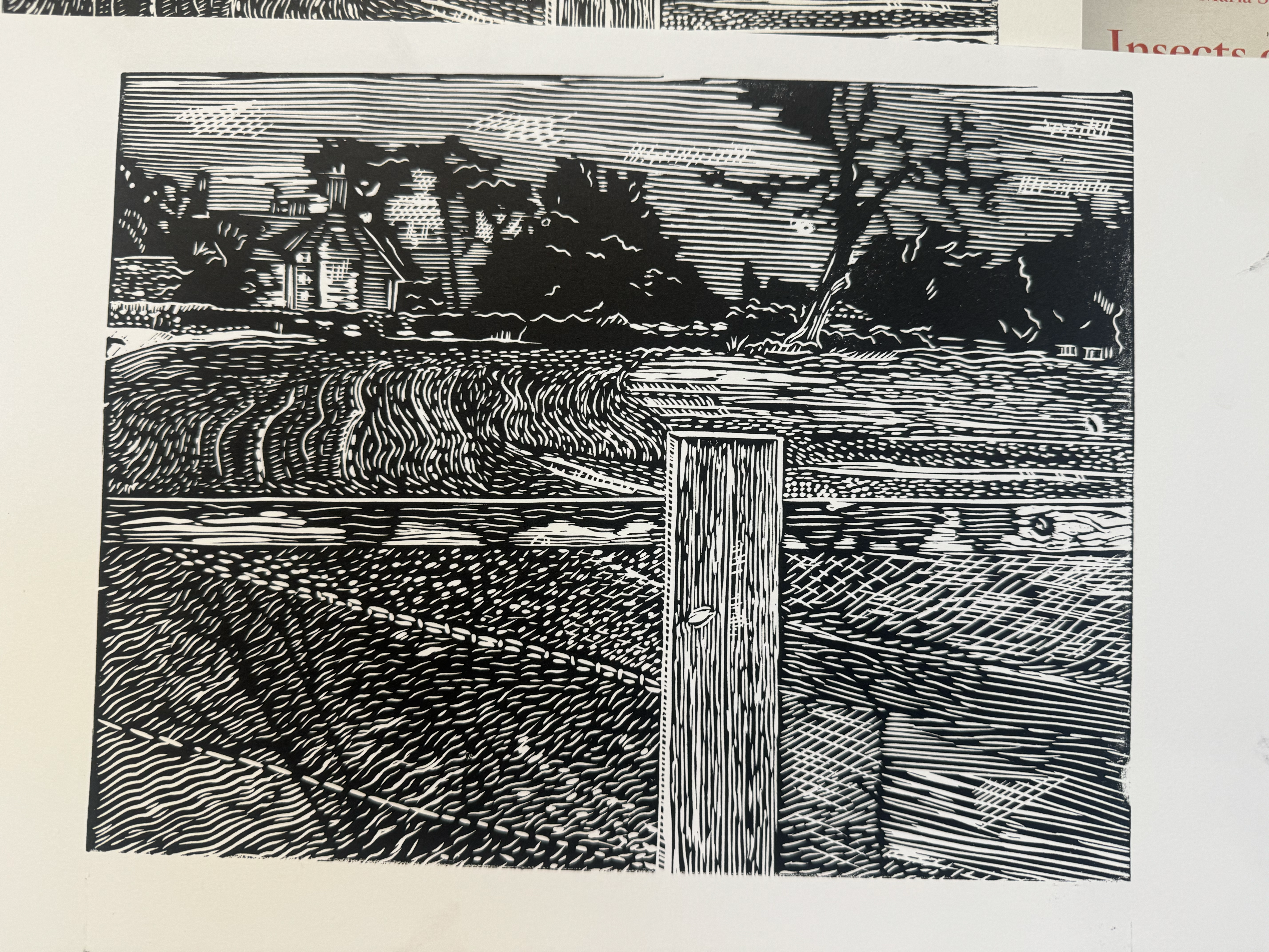
Hilary 2024
The prints from the term:
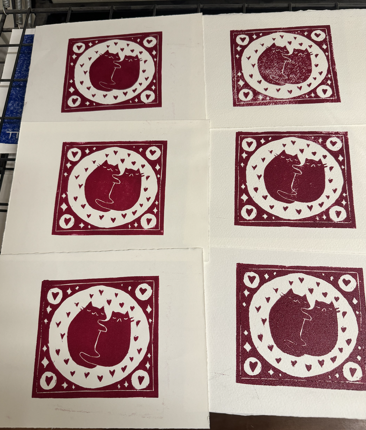 Valentine’s day cards for friends, very typical early Malaika style
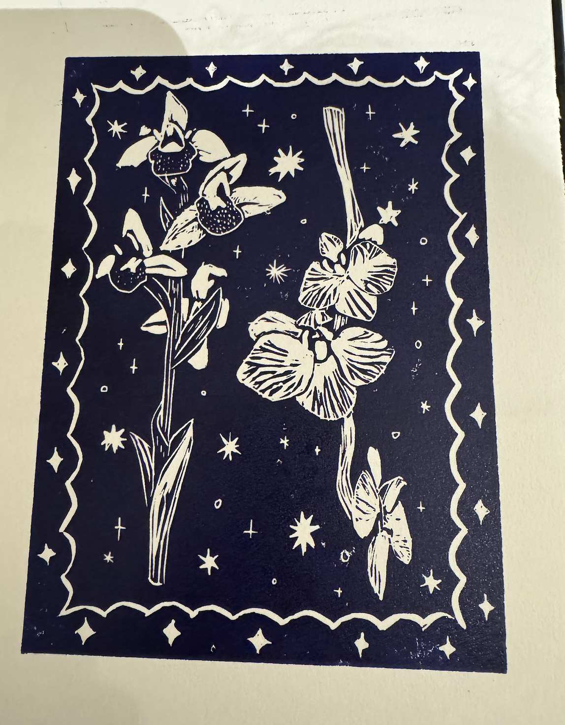 A print that I ended up using as a Mother’s day card, inspired by a visit with friends to the orchids exhibit in Kew Gardens
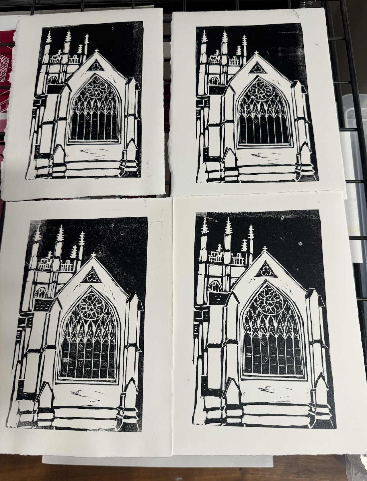 An attempt at something more complex: Merton College’s Chapel. The window detail, deciding what should be dark and light, made this one particularly challenging, but very fun!
50 Hurst Street
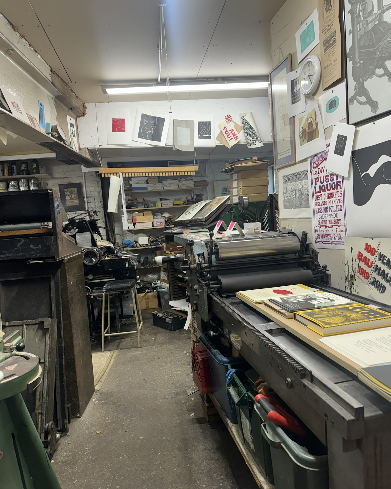
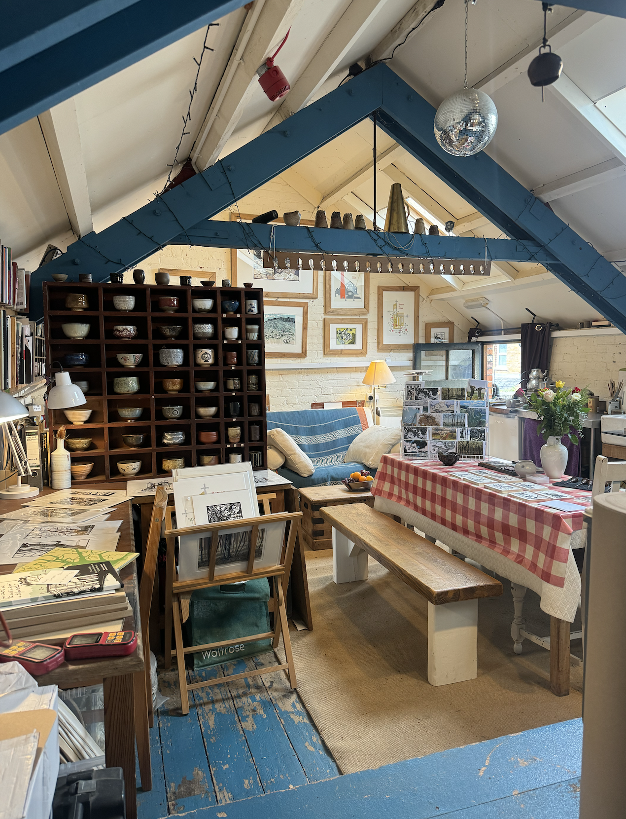
At the end of Hilary, I had a transformative visit to 50 Hurst Street Art Studio in Oxford: they had an open day for people to visit. It was a beautiful studio, where several talented printmakers are based.
I was particularly drawn to this reduction lino print of the woods:
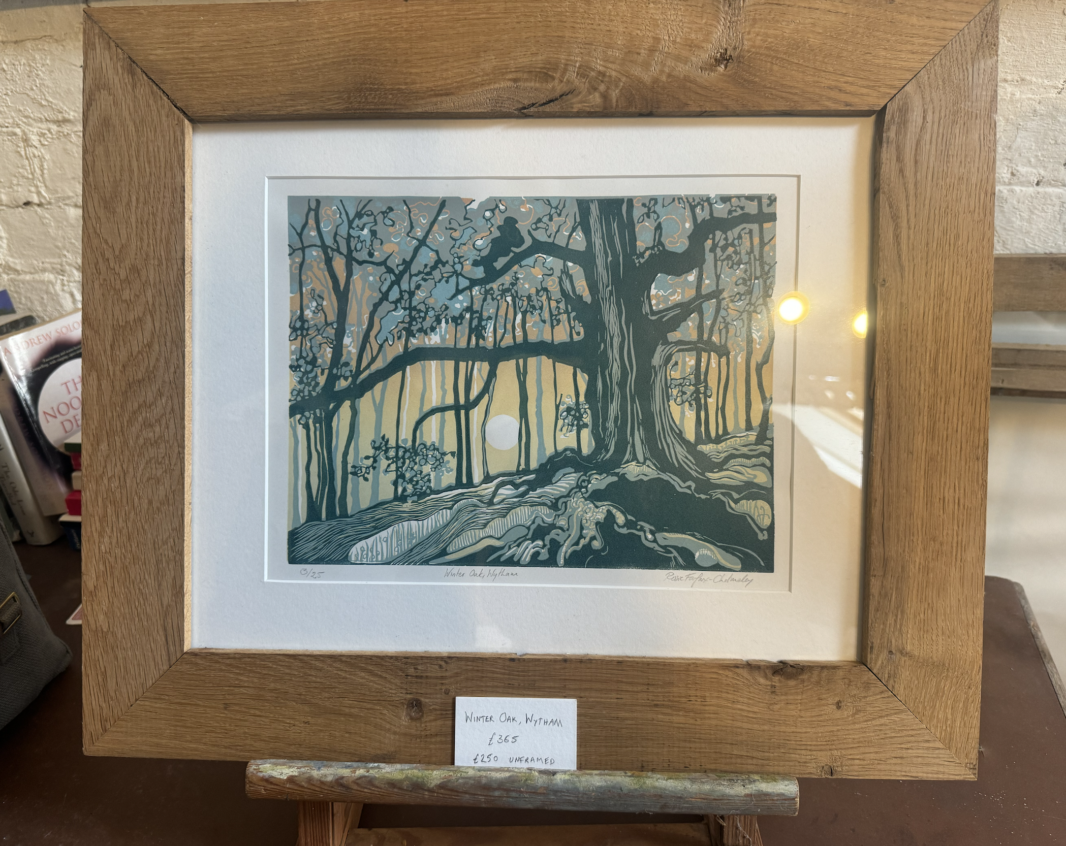 It was so much more sophisticated than anything I had done. The art room beginner prints were just about shape (maybe 1 colour), but this was about everything that classical painting requires you to know. Composition, colour, form, texture, how exciting! Seeing this work really influenced my work in the following term.
Trinity 2024
The Kyoto Print
In the holiday before this term, I visited Kyoto and took this photo on a late-night post-rain wander.
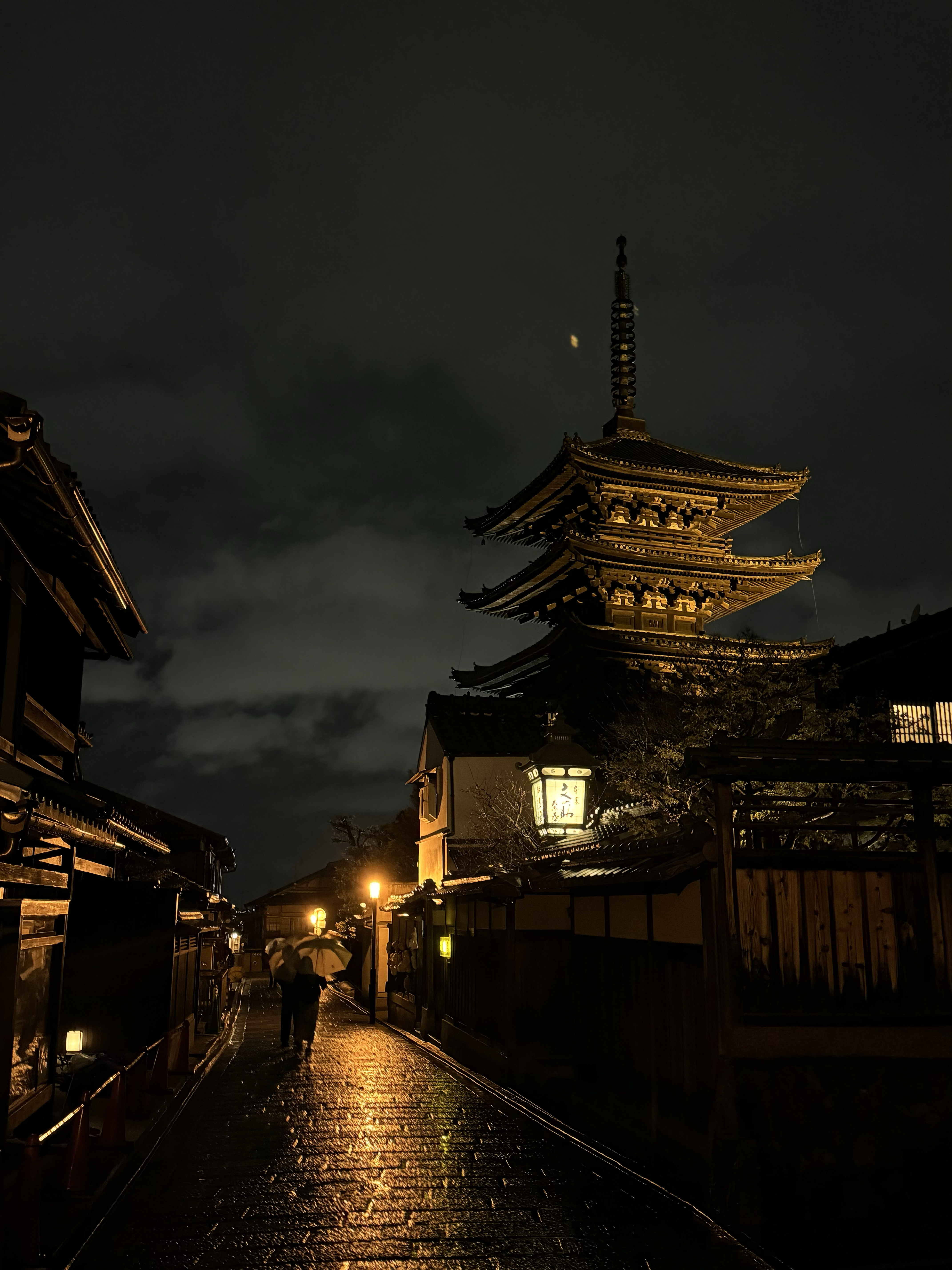
The way the light hit the cracks in the stone paving, the lighting, the wood, something about this image just takes me back. And also, it looks like the perfect candidate to be a multi-colour print! I am more comfortable with architectural shapes, like this, than nature, like the forest print that initially inspired me.
I spent most of the term making this:
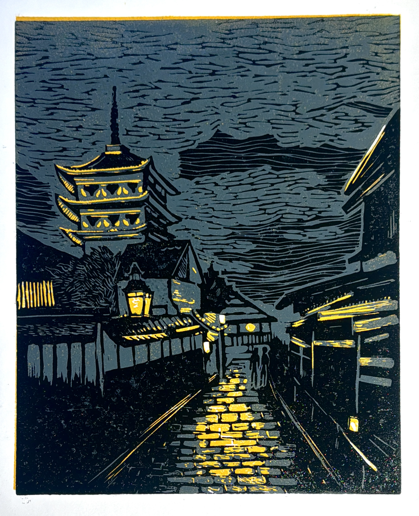
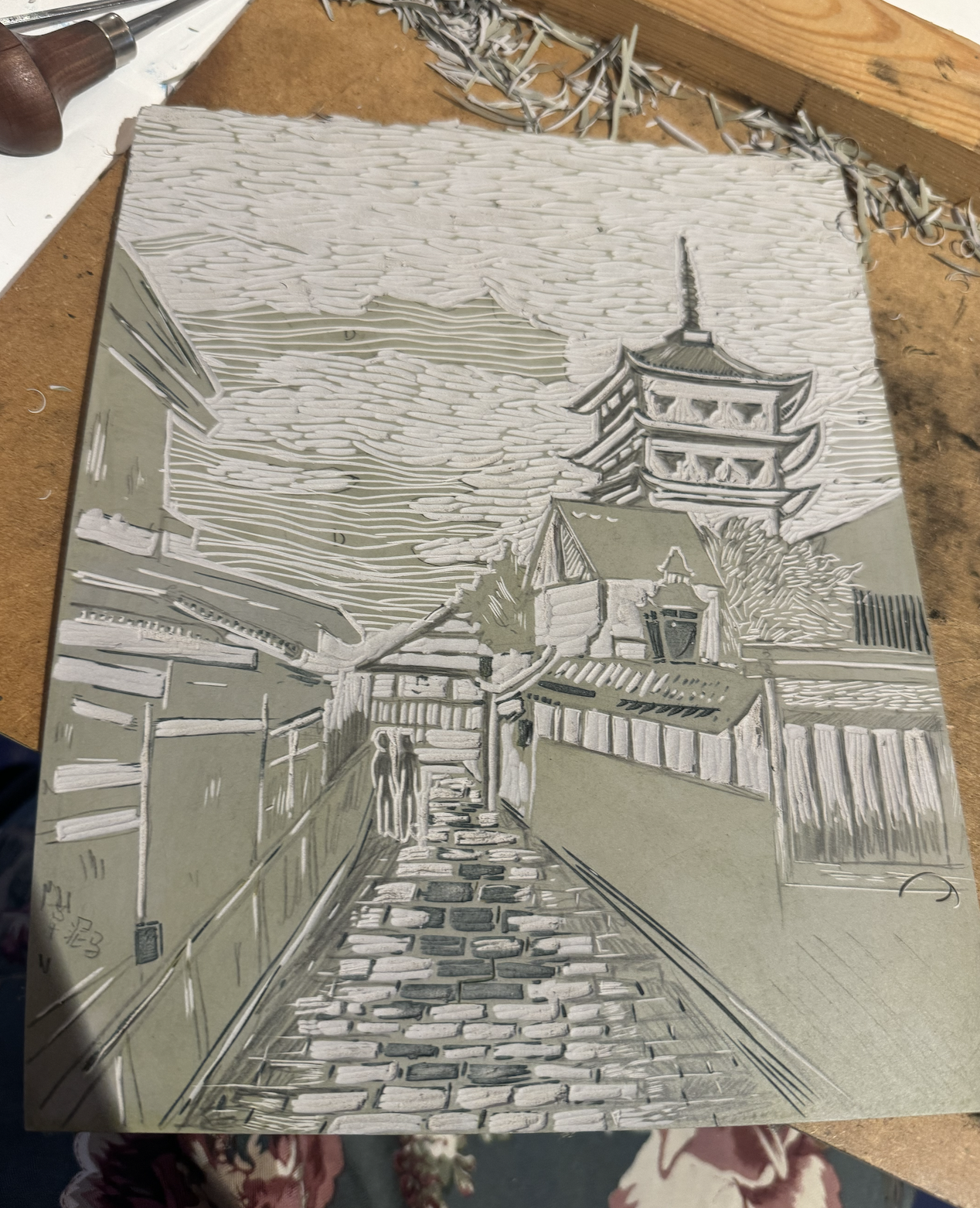
This print is a reduction, meaning that I carve the block, print one colour, then carve the same block, print the next colour, and so on. As a result, I cannot make more of this one! This was definitely the most challenging print I’ve worked on: converting the original image to 3 colours, aligning the block each time I printed, staying consistent with the project over weeks, choosing textures. There are few art pieces I am pleased with, and this is one of them. I think it came out almost exactly as I had imagined (except it’s mirrored because I forgot that block printing mirrors the image).
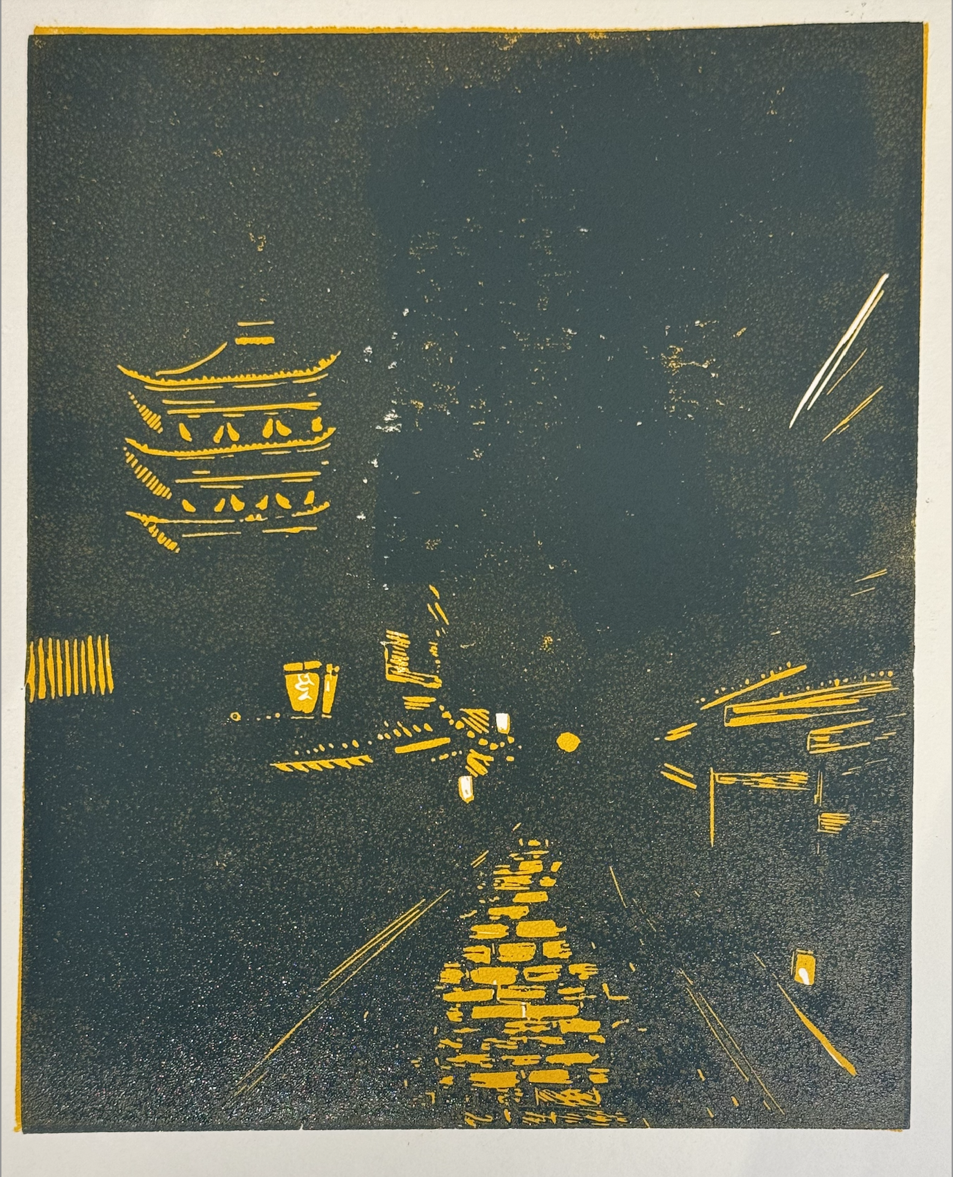
This is the print without the final black layer and the block itself:
Other prints from the term
In the rest of the term I made a couple prints that I dislike but we can call them learning exercises:
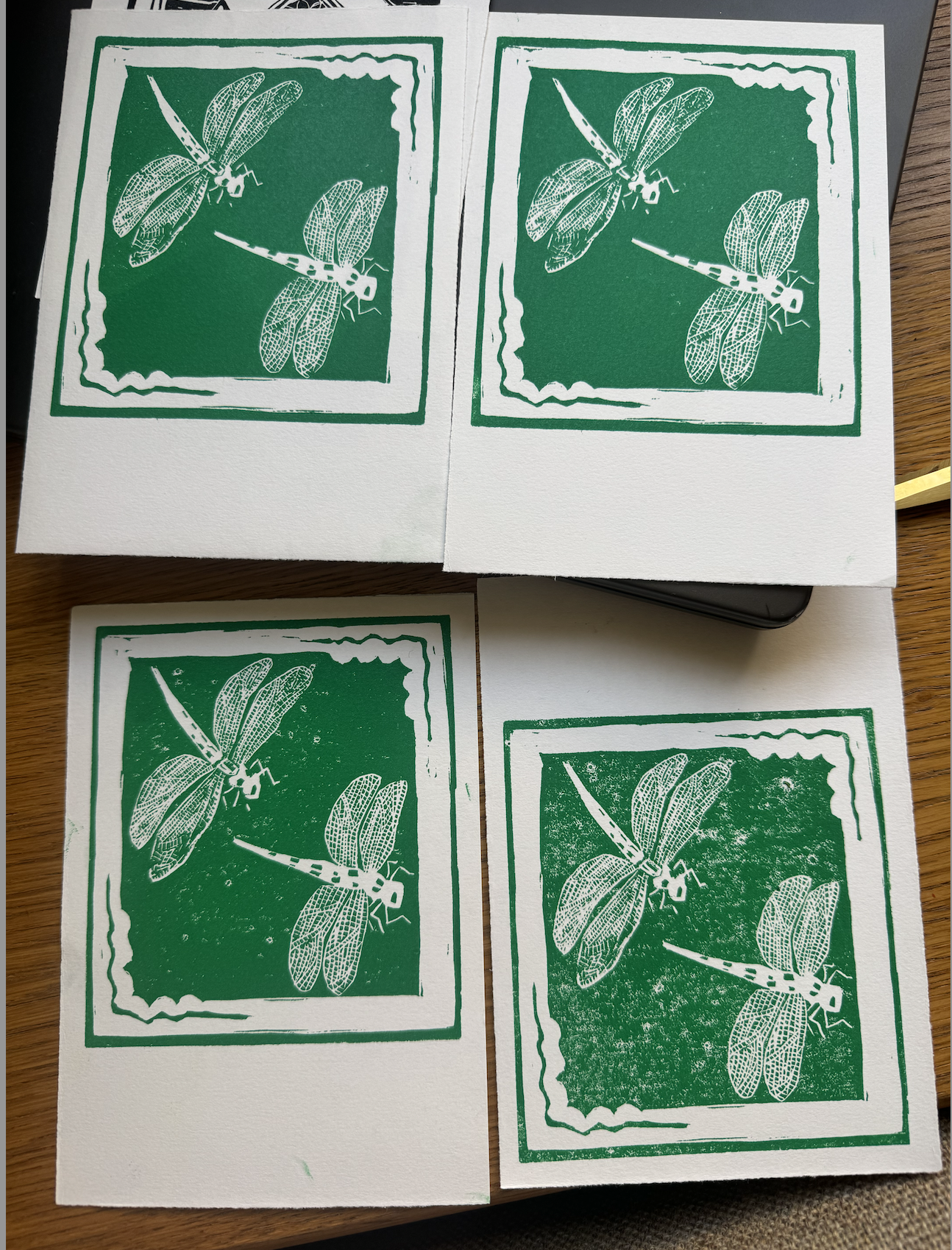 A pair of dragonflies - wanted to take on the challenge of the wing texture, but I think it looks a little scrappy/boring
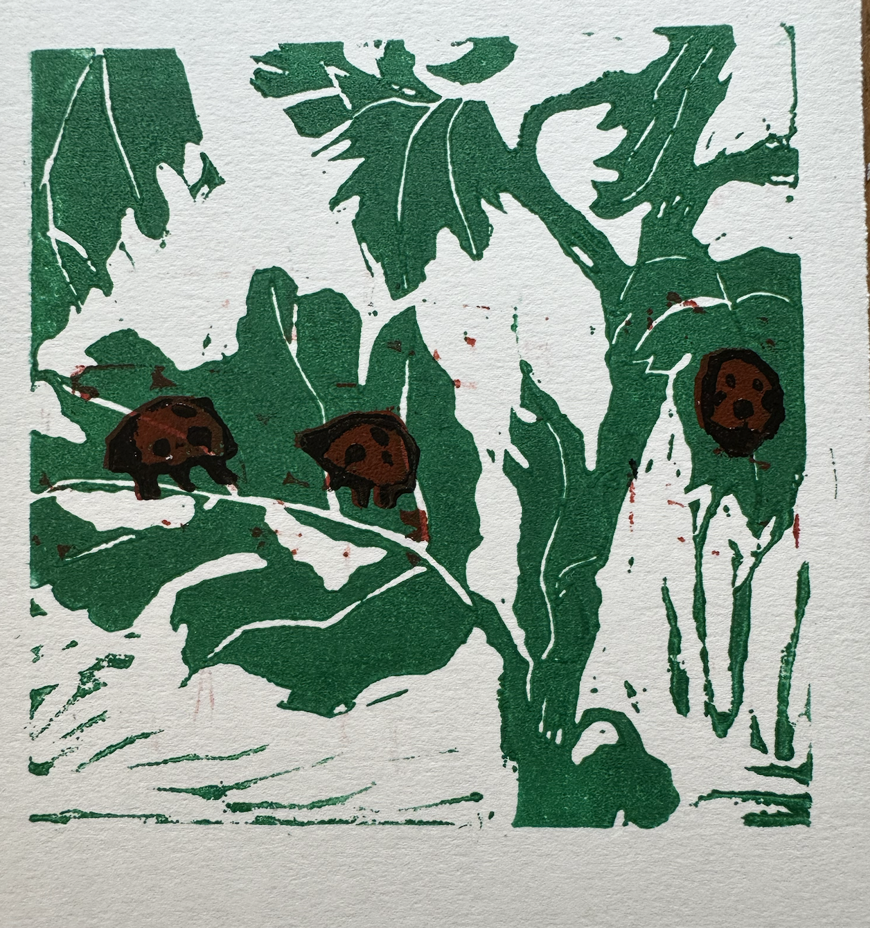 Here I tried to do a multicolour print using 3 blocks (instead of reduction). Red over green is a bad idea. I do like the texture of the leaves but the ladybugs ruin this one.
An adventure in typesetting
Oxford is where some of the first books were printed. Art room regulars made a visit to the Bodleian Bibliographic Press, where a lovely man by the name Richard taught us how it was done.
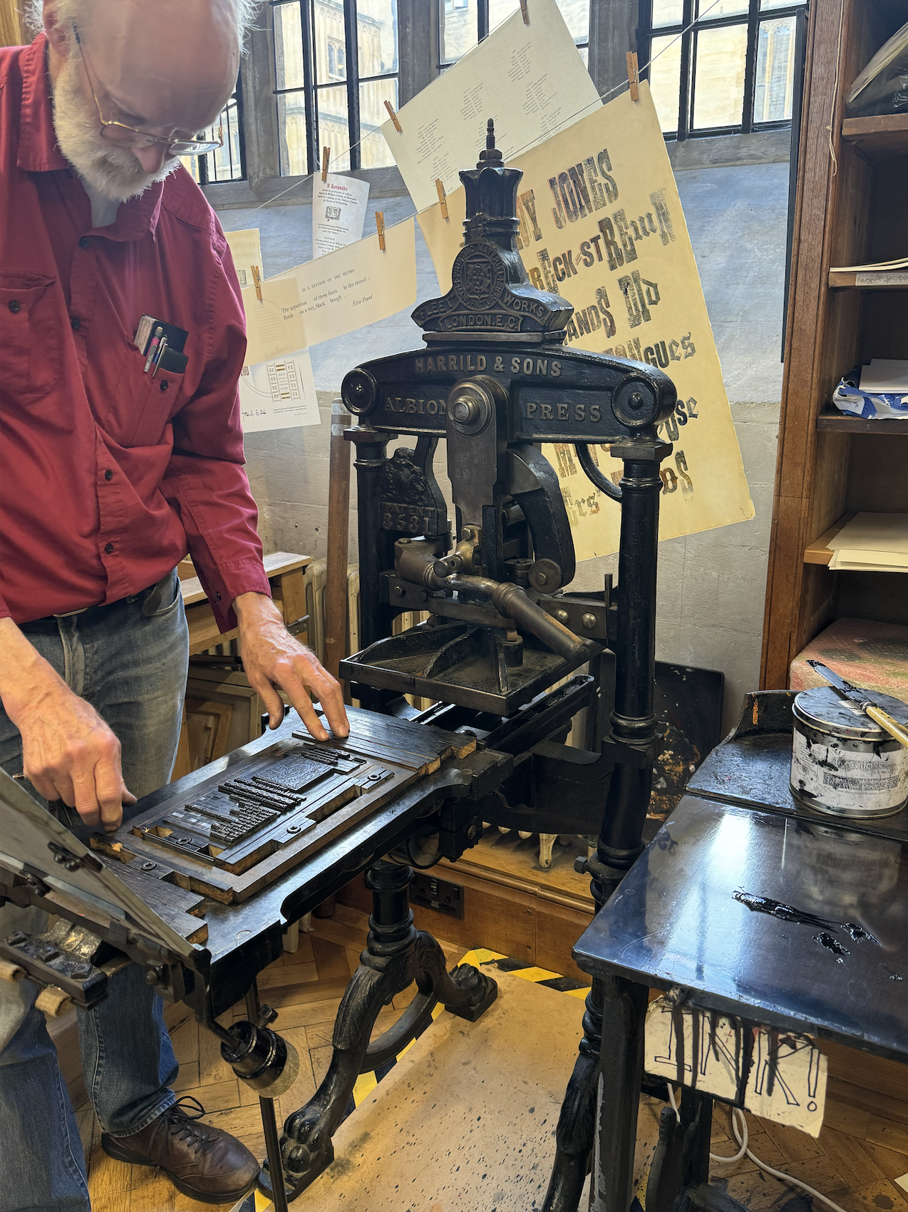
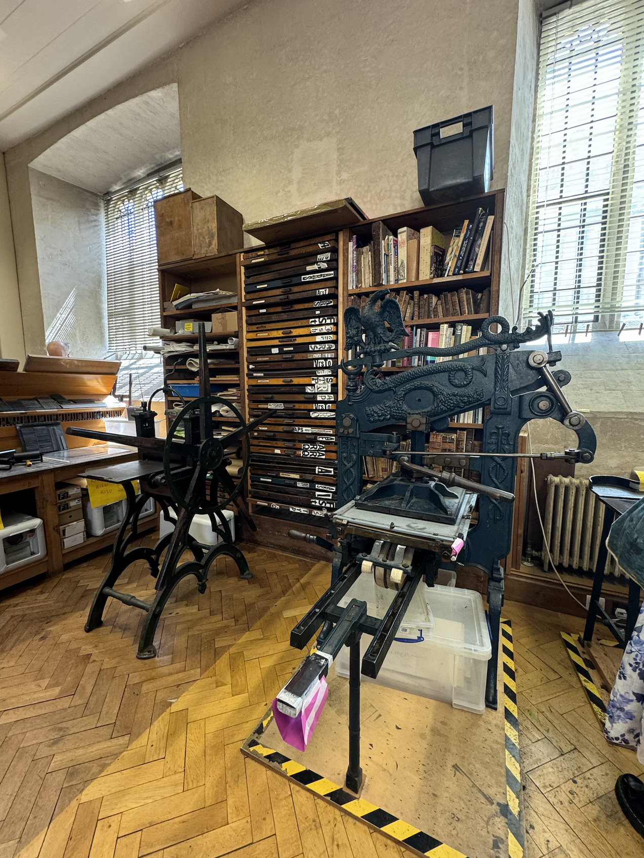 I’m a big fan of the press with the bird on the right. Things used to be made so beautifully.
Essentially, letter blocks like these:
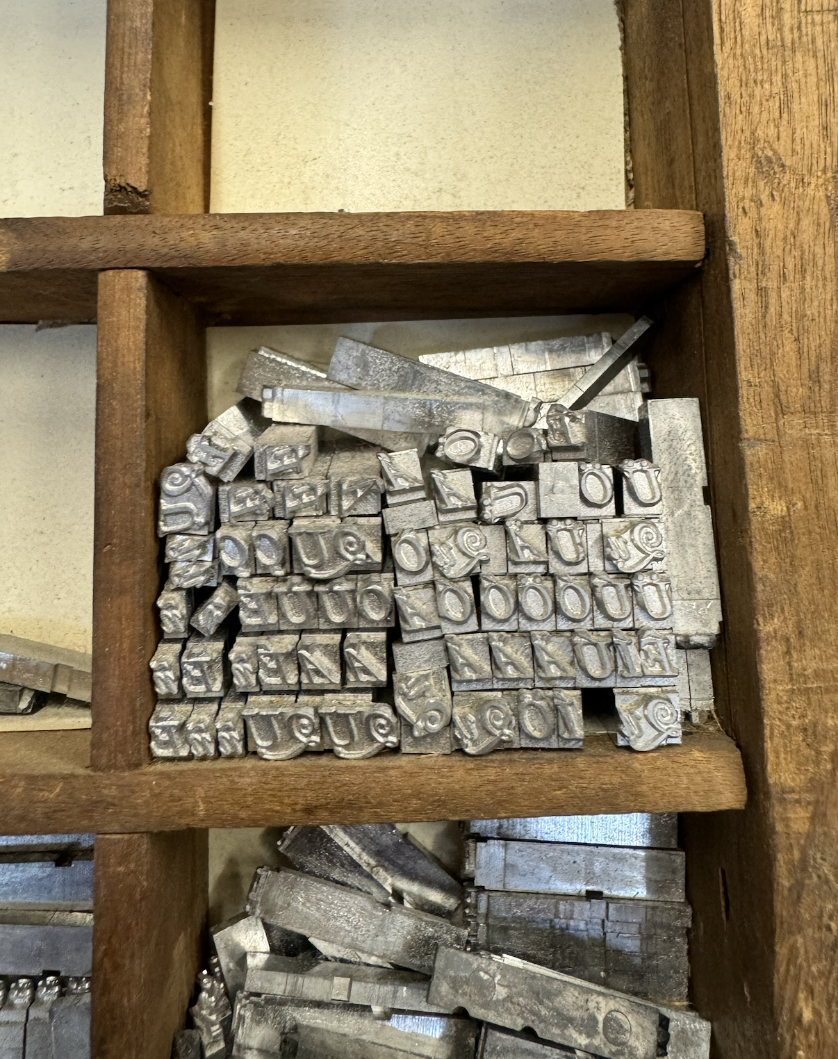
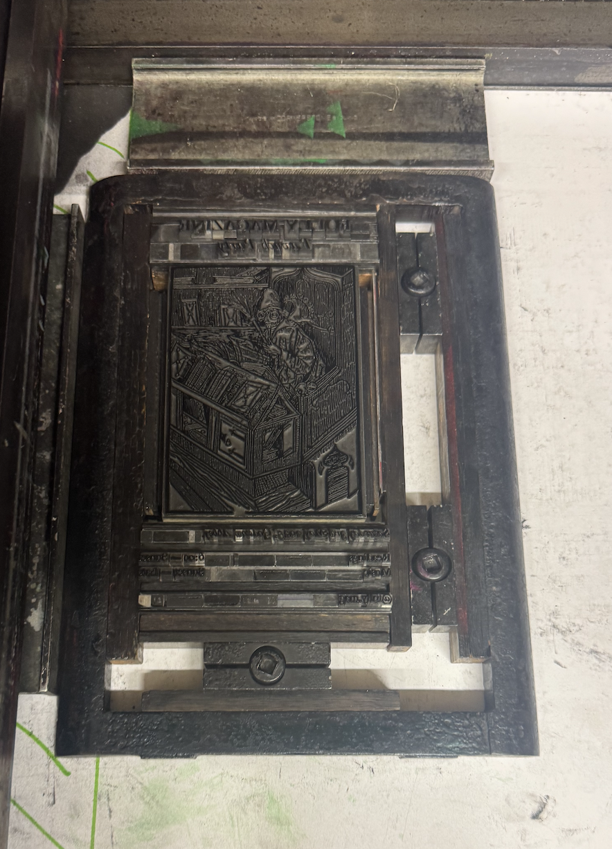
are placed in a ‘frame’ to make text: and clamped so that they don’t fall out.
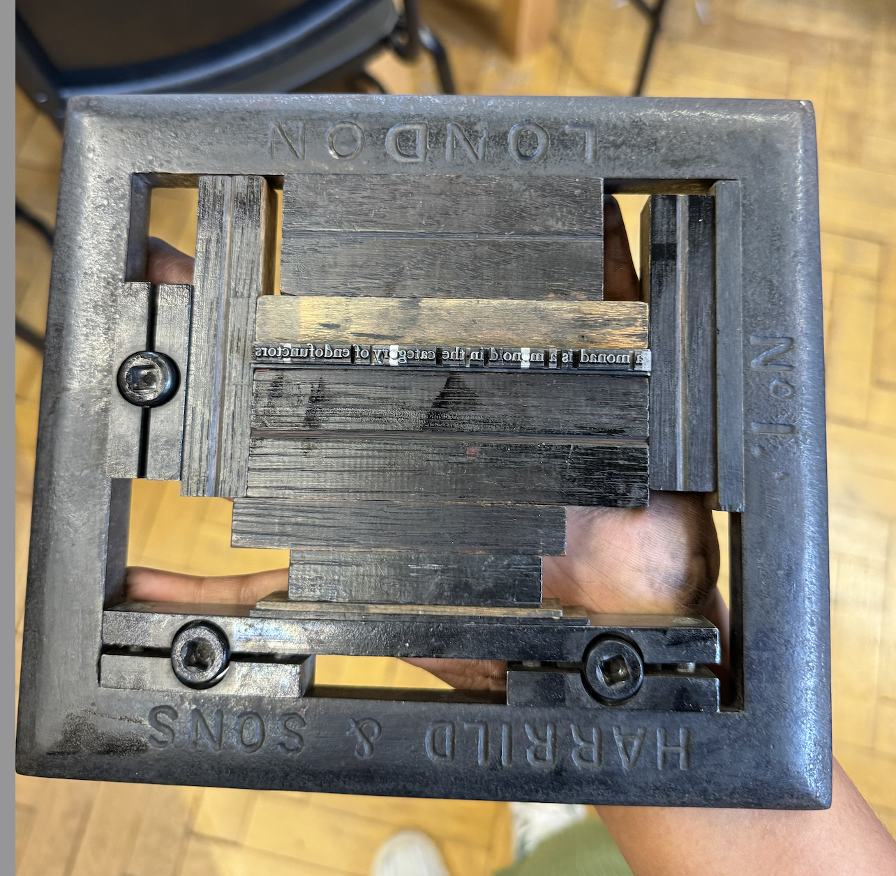
Then the frame is inked and printed onto a sheet of paper using a press (like the Albion, but there are other types too). The outcomes were something like this:
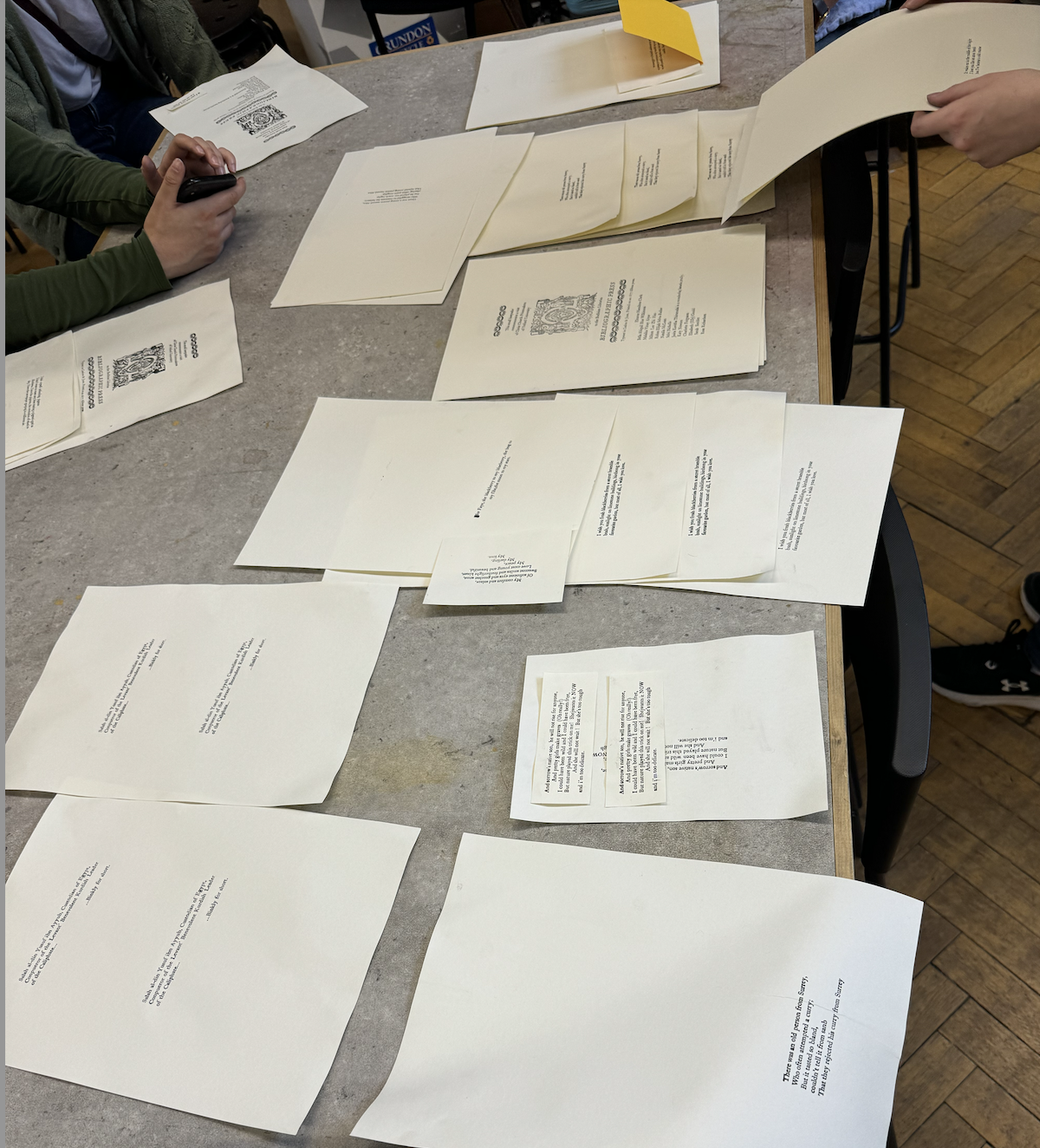
A fun fact is that while Shakespeare is credited for making up many words, it is possible that many were the result of errors in the typesetting. Typesetters were not very educated, paid poorly, and generally tried to finish their work quickly to run off to the pub, and as a result early print had numerous errors.
Michaelmas 2024
I’ve been working on a reduction print of this photo from my trip to Norway
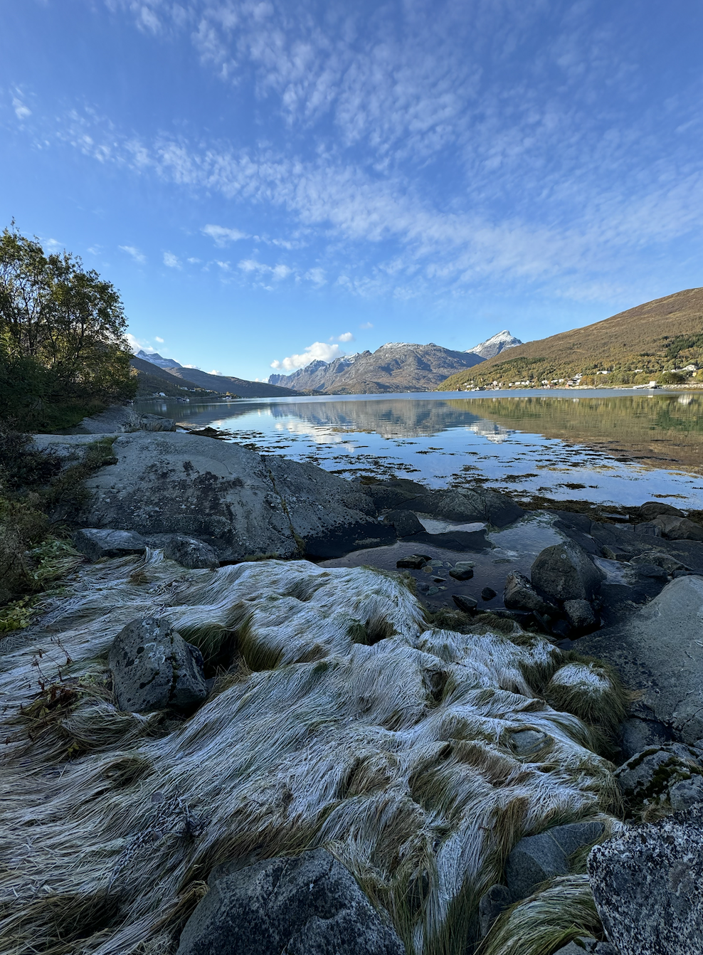
I hope to use 4 colours: sky blue, green, a grey/brown, and a dark brown/black. Picking colours has been fun. This print might take me the whole term with how tedious it is.
So far, we have the first layer:
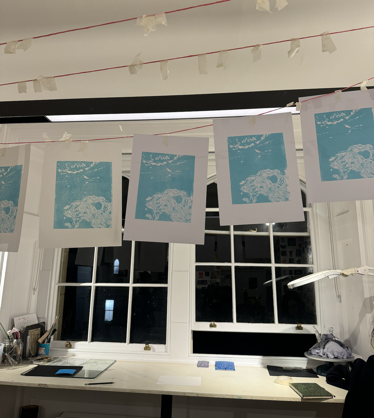
and more to come!
Hilary 2025
What Malaika in the past didn’t know is that the term would be too difficult, and I got tired of that print and never completed it.
However, I started a challenge to do 8 prints (1 per week) this term.
Here’s how it’s going!
week 1: I made a small beetle, but I lost the block before I could print it :,( so you’ll have to trust me and i’ll try to find it…
week 2: wanted to try something nature/foresty
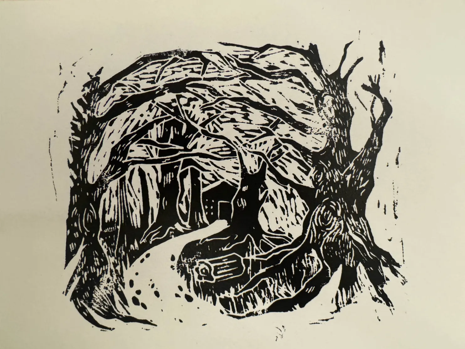
week 3: the art room!
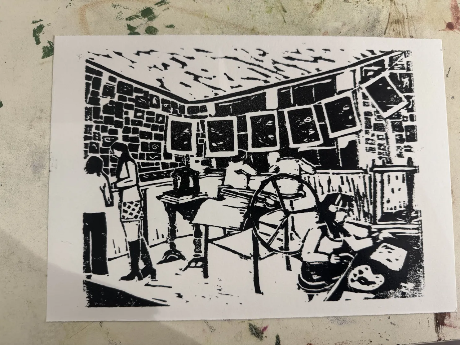
week 4: a commission for a friend!
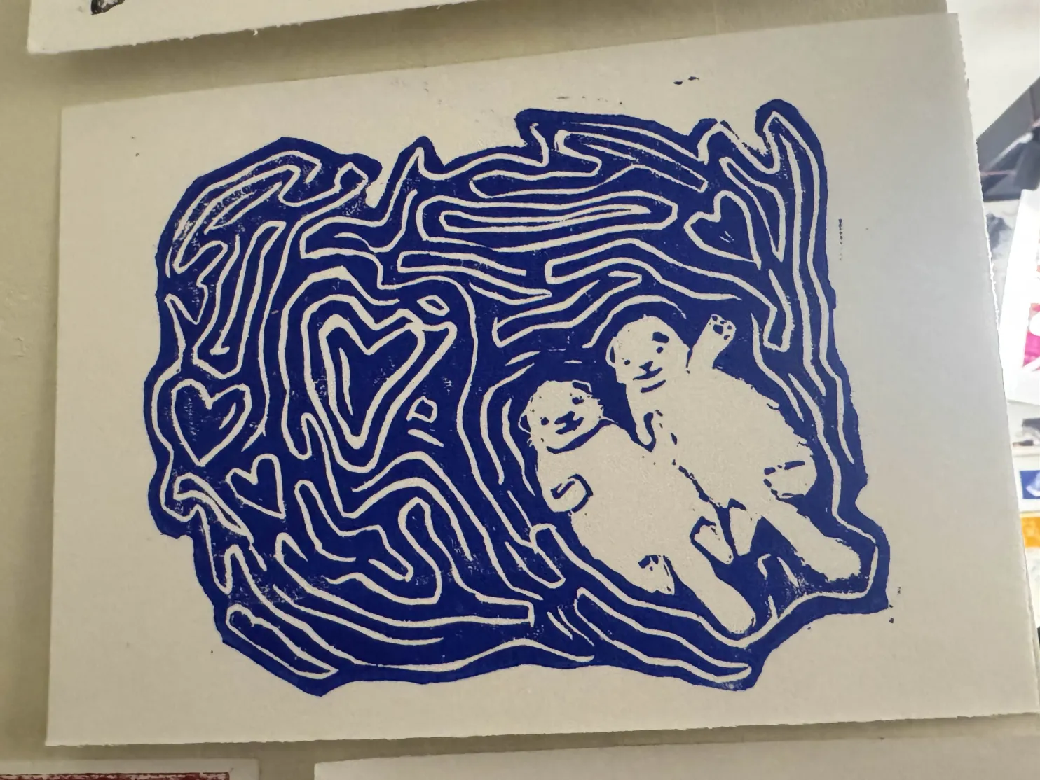
week 5: the Albion press — see above in ‘adventure in typesetting’ for a picture of an Albion press. This is the one that is in the art room. My teacher Sarah asked to keep one for herself (not the art room wall!), and I was really flattered :)
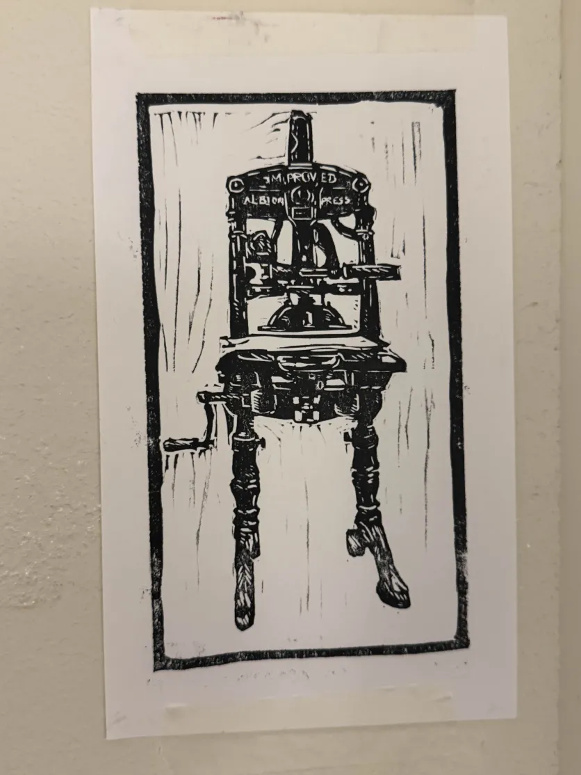
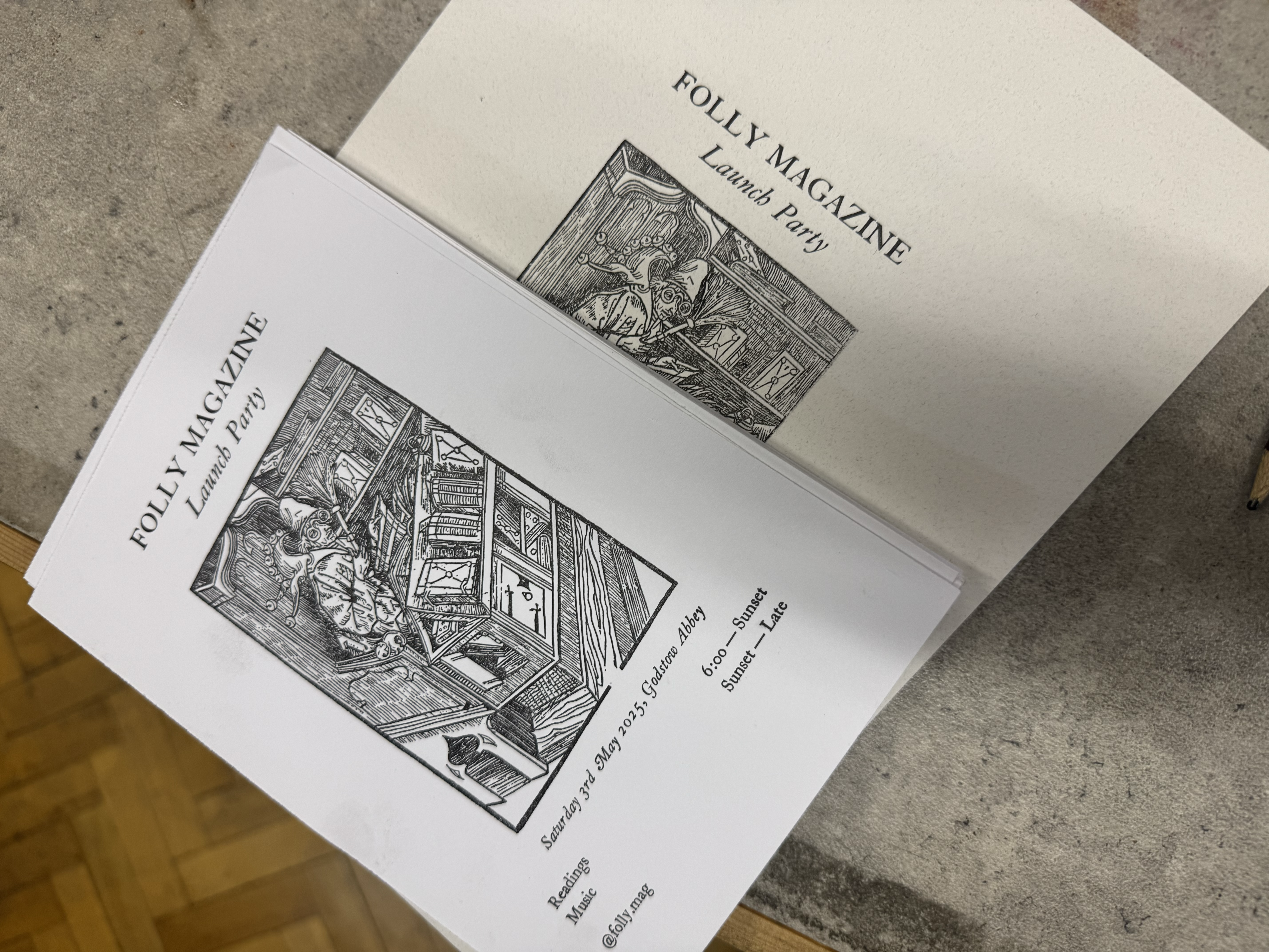
week 6: another trip to the Bodleian Bibliographic Press to help Folly produce invites for their launch party. super fun! the block is not by me, it’s one that the Bodleian has stashed for use by anyone. I wonder how old it is.
